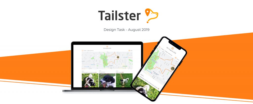
Tailster Case Study
Prototype Quick Links
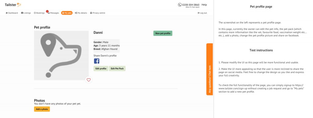
The Brief – Part 1
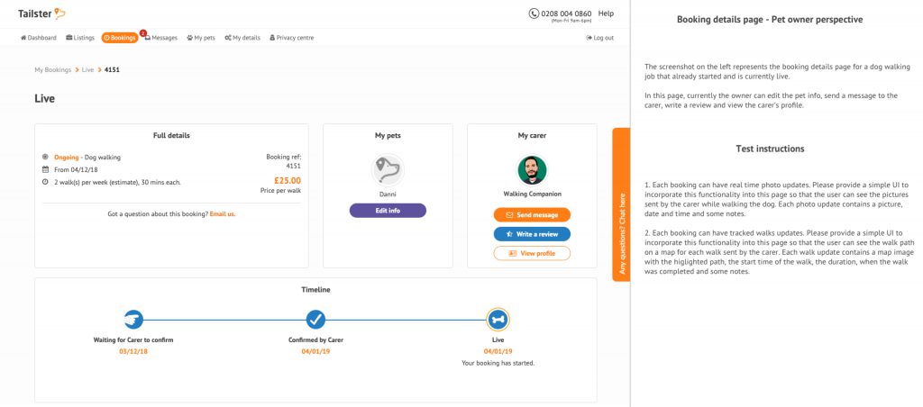
The Brief – Part 2
My Approach
Discover – Define – Design – Deliver
- Understand the problem statements
- Review existing Tailster branding and experience
- Research other pet service providers
- Persona creation
- Sketching/wireframing and ideation
- UI toolkit
- Visuals in Sketch (mobile & desktop)
- Prototyping in InVision
- Next steps
Understanding the problem statement
My interpretation of the task is to improve the usability and visual aesthetics of Tailster’s pet profiles and bookings. Ultimately this will encourage users to be more engaged by the service, interact with the functionality and share/promote the service on social media.
Tailster Observations
- Inconsistent CTAs in terms of colour, size and shape
- What is the purpose/value of the heart icon on the profile picture?
- No obvious journey or primary action
- Check accessibility of orange text
- Only social media share option is Facebook
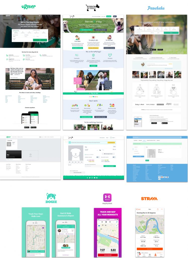
Competitor Analysis
After reviewing the Tailster online experience I looked into some other Dog walking service providers. I signed up to them so I could review their pet profile pages. I also looked at some apps that use GPS tracking for inspiration.
Persona Creation
Without data about the customer base, I have created a persona based on assumptions about one segment of Tailster’s audience, their values and needs as a dog owner.

Notes/Ideation
After gathering research, I began noting down some potential ideas to explore.

Sketching/Wireframing
Sketching out my ideas, I felt that the pet profile page would be best split into 2 pages. 1 as a simple overview where the user can see all of their pets in one place, and one that goes into more detail with the full pet bio and photos. I also wanted to simplify the Bookings page and have a timeline in the form of an infinite scroll, much like social media such as Instagram, highlighting the maps and photos from each walk.

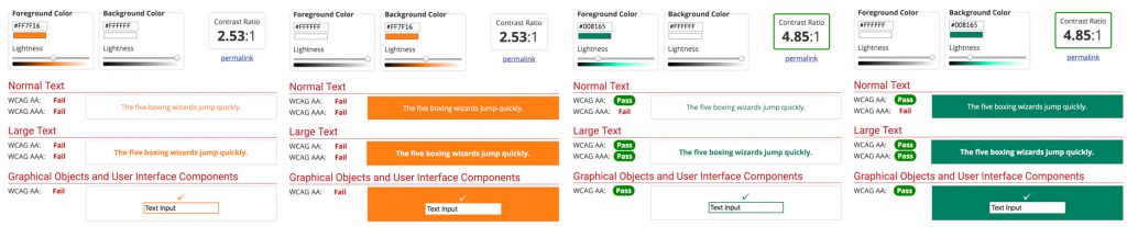
Accessibility
The orange colour (#FF7F16) Tailster currently uses in its UI for text or as a background colour to text is not accessible and doesn’t meet AA standards. Going forward in my designs this colour should only be used as a supporting colour. I have taken the green (#008165) used in Tailster’s branding on the homepage. This meets AA standards and so can be used for text links, CTAs etc.
Source: https://webaim.org/resources/contrastchecker
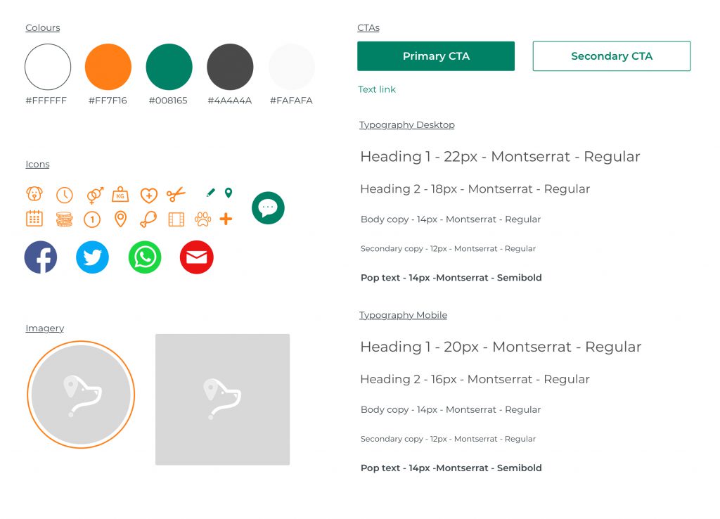
UI Toolkit
The UI
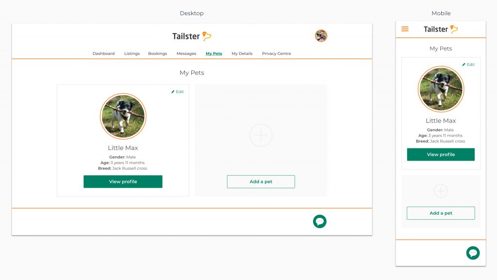
My Pets
Prototypes are available here: Desktop & Mobile
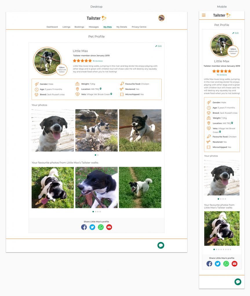
Pet Profile
Prototypes are available here: Desktop & Mobile
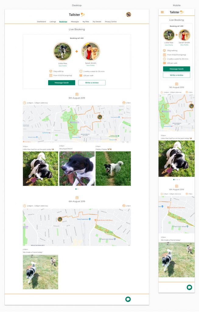
Live Booking
Prototypes are available here: Desktop & Mobile
Next Steps
Given more time on this task I would proceed as follows:
- Map out the user journeys
- Design for alternate scenarios, e.g. where an owner has more than 1 dog to be walked or no images have been uploaded
- Design the expanded state for images whereby users can view a larger image and share it to their pets profile or their social media e.g. Instagram
- Conduct usability testing to establish the ease of use of the components and journeys
- Conduct user testing/focus groups to determine the perception of the brand with the updated UI